Advanced Typography task 2a and 2b
13.09.2023-25.10.2023
Guan Wee Lun/0364012Advanced Typography/Bachelor of Design in Creative Media
Task 2a & 2b
CONTENT
Lectures
refer to task 1
Instruction
Task 2
Task 2A - Key Artwork
requirement
- Explore and compose as many permutations and combinations of your name in the form of a wordmark/lettering.
- The final key artwork must be an elegant solution, well balanced and composed, not complicated or confusing that leads to afunctional and communicable key artwork.
Process
Week 1
Idea and sketches
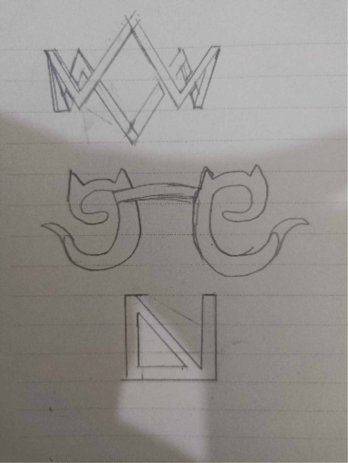
I am thinking of creating a key artwork regarding on my last name-WEELUN, so I starting to identify what am I who am I, what do I like. First of all, I think of my appearance which is a normal student who are wearing glasses, so my first idea is about glasses, I find out that my brand of glasses is an owl, I get inspired by that owl. Next, I think of my destiny, or what do I want to change, I want to control myself not just emotion, so I think of a crown that inspired by the game Genshin Impact that they are a crown on top of the name.
Reference
Figure 1.1 reference 1
Figure 1.2 reference 2
Sketches
Figure 1.3 sketches 1
Digitization
Figure 1.5 digitization 1
This digitization is my first attempt for the second week from the assignment posted, the top is a crown the spelled W, the glassed bottom that have two cat that look like fox is spelled as "EE", and the below is LUN, I mixed the alphabet into one, but in the end, it's said that it cannot be recognized, it cannot be read although I very love this logo but it cannot be read.
Week 2
So back to the sketches phrase
Week 3
so, I get inspired by the second one and then I think of maze, and Pac man game that I played while I am small. I created a key artwork of Pacman. I used my first alphabet of Wee,"W", and LUNFigure 2.1 digitization 4
but still it cannot be readable for it, so I started to improve on this, and it became like this.
Still, it looks messy and not usable, so I throw away the idea of Pacman and started a new one.
Week 4
Process again
Figure 2.5 submission 4.PDF
Task 2B - Collateral
Requirement
- Apply the key artwork on collateral (T-shirt, pins, stickers, etc.)
- Expand the key artwork with relevant designs.
- Create an Instagram account and post the key artwork & collateral, plan the layout.
- Made an animation/gif.
Process
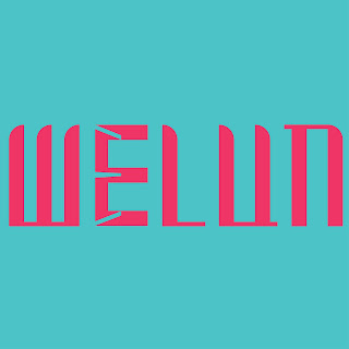
I expand the key artwork by E inside the E, I made the combine two E into One, One is the stroke and I one is using the negative spaces, I expand the negative spaces into three stroke and expand more.
Figure 2.7 process 1
After that I change the background into the same tone to made my ig look better
Animation
I used the expansion process to make an animation that about 60 frames.
I just put my portrait and put my word mark in the middle and inserted the collateral inside the post.
Final Submission - Task 2B
Instagram Account = https://www.instagram.com/des.weelun_ign/
Figure 4.7pdf
Feedback
Week 4
Specific Feedback: Readability of my wordmark are low, and need to redo, the form is not stable, and I need a stable form.
Week 5
Specific Feedback: some of the element is tiny as it cannot see if I minimize the key artwork, and the readability still little,
Week 6
General Feedback: Avoid using monochromatic color, and expand wordmark to an identity
Week 7
General Feedback: Finalize it and put it on collateral and arrange IG.
Reflection
Experience
I think the experience of this task is kind of fun but very stress, because most of my attempt of project are rejected but still fun, the experience of this task is not boring creating the same word and it's a identity of me, so it's useful.
Observation
Through this task, I observed that not just idea work in design, but also readability all I think is a wordmark that represents me but not readable, because of some reference that is very artistic inspired me in the beginning. All I did is just design, but not testing out it can be work or not until the very end.
Findings
through this task, I find out that my technique of illustrator improves from last semester, and I can create something that represent my idea not just something incomplete that look terrible but still no good enough just so so only. Also I find out that I don't know why the meaning of me are as the very beginning we need to think of the definition of the word mark that represent me but still I don't recognize me enough.


.png)

.png)
.png)


.png)
.png)


.png)


.png)
.png)


.png)

Comments
Post a Comment