Advanced Typography Task 1
Advanced Typography/Bachelor of Design in Creative Media
Task 1 Exercise
Content
Lectures
WEEK 1/30.08.2023
- AXIAL= information organized into a single axis that being left or right, divided into different group
- RADIAL= all elements are extended from a point of a focus, and spread out
- DILATIONAL (ring)= element expand from a central point in a circular manner
- RANDOM (MOST TIME SPENT) =in a chaos, the balance of structure, crucial information are clear
- Grid= a focus point to give attention to viewer
- TRANSITIONAL(Band)= it needs a sense of balance of space, also an informal system for layered banding
- BILATERAL=All text is arranged symmetrically, mostly used as invitation card
- Modular = Element constructed to a standardized unit, the unit can be randomly place as it's already standardized
WEEK 2/06.09.2023
AdTypo_2_Typographic Composition
Rule of Third: it's a photography term but not commonly use in typography.
Form and movement: based on existing system. this system is to get student to explored.
WEEK 3/13.09.2023
AdTypo_3_Content and Creativity
Handwriting-handwriting is the first step of creating letterform in the past, without handwriting there might not be typography.
the whole lectures are about history and culture of the letterform creation in Europe, it is almost the whole heritage of Europe letterform, but for letterform in Asia, the letterform keep changing and mostly ancient letterform cannot be recognized by now. It is important that our culture to be carry to the future generation.
WEEK 4/20.09.2023
AdTypo_4_Designing typeface.
- Type design carried a social responsibility, so we need to continue to improve its legibility.
- A form of artistic expression

Johnston Star/Underground typeface: Created by Edward Johnson, its purpose is to create a typeface for London underground railway posters.
General process for typeface creation
- Research
- we should understand the type of history, autonomy and conventions, thermology, side bearing, metric etc.
- determine type purpose, what different applications it will be used as.
- Sketching
- more confident by using hand and have a better control,
- using digital tool might impede natural movement.
- Digitization
- Font lab and glyphs app is the leading app.
- Attention should not just give to the whole form of type but also the counter form, the readability and legibility are counted on counter form.
- Testing
- The result of testing is part of the process of refining and corresponding aspects of typeface
- Deploy
- Even after deploying, there are still some teething problems, so getting feedback and keep testing is important
- Roman Capital
- Using grid can facilitate the Contruction of a letterform.
WEEK 5/27.09.2023
Instruction
Task 1
Exercise 1-Typography system
I started research by seeing past year student e portfolio for reference and some inspired me, also I red the Typographic system and also a reference for me to do this exercise.
Axial System
.png)
Figure 2.1 Axial system first tried (30.08.2023)
.png)
.png)
.png)

Figure 2.5 First Attempt (06.09.2023)

Figure 2.6 Axial System Sixth Tried (09.09.2023)


Figure 2.8 Sketch Layout


Radial System
In the first place, I am going to build two circle, one big circle in the middle, and one small circle at the bottom left for the bottom left I put the title and the important Information outside the circle, and made the title to be green in order to attract reader eyes. I put the schedule on the middle.
.png)
.png)
Figure 3.2 Radial System Second tried (04.08.2023)

figure 3.3 First Attempt (06.09.2023)

Figure 3.4 Final Radial system (10.09.2023)
Dilatational System
.png)
Figure 3.5 Dilatational System first tried (31.08.2023)
.png)
.png)
.png)
Figure 3.7 Dilatational System second tried (04.08.2023)

Figure 3.8 First Attempt (06.09.2023)

Figure 3.9 Final Dilatational System (08.09.2023)
Random system
Firstly, I tried putting everything in mess, and arrange it to something that I am satisfied with.
.png)
Figure 4.1 Random System First tried (01.09.2023)
.png)
Figure 4.2 Random System Second tried (01.09.2023)
.png)

Figure 4.4 First Attempt (06.09.2023)
Grid system
.png)
After that I increase the font size of the date and color to emphasize its importance
.png)
Figure 4.6 Grid system second tried (01.09.2023)
After few days, I change to color into red to made it the same to the title and added some graphical element to it.
.png)
Figure 4.6 Grid system third tried (05.09.2023)

Figure 4.7 Grid system first attempt (06.09.2023)

Figure 4.8 Grid system final (10.09.2023)
Modular system
Modular system is that I put in the box can be arrange into the same category so, I started with making the title using the biggest box, and the other to put in the one or two size.
Figure 4.9 different version of modular system (04.09.2023)
At last, I made it simple, I put the title at the top and I put different idea in the box that can arrange, using just one size.

Figure 4.9 different version of modular system (04.09.2023)
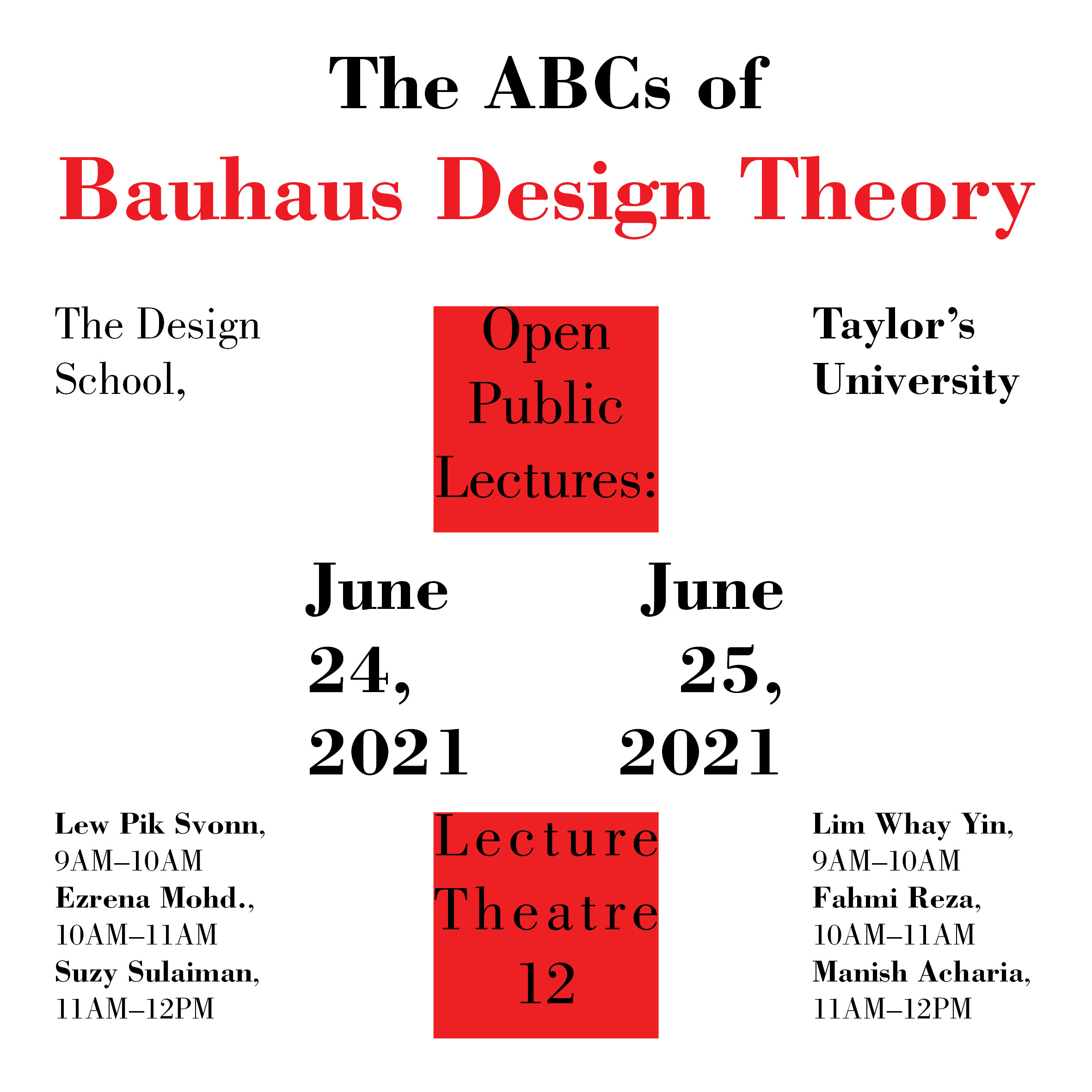
figure 5.1 Modular system First attempt (06.09.2023)
middle

figure 5.2 Modular system Final (08.09.2023)
Transitional system
.png)
figure 5.3 Transitional system first tried (04.09.2023)

Figure 5.4 Transitional system First Attempt (06.09.2023)
Figure 5.5 Transitional system Final (08.09.2023)
Bilateral system
For bilateral system I created three version of it but, I am satisfied with the third one so, that going to be the final for me
.png)
Figure 5.6 Bilateral system version 1 and 2 (04.09.2023)

.png)
Figure 5.6 Bilateral system version 1 and 2 (04.09.2023)


Figure 5.8 Dilatational System. JPEG
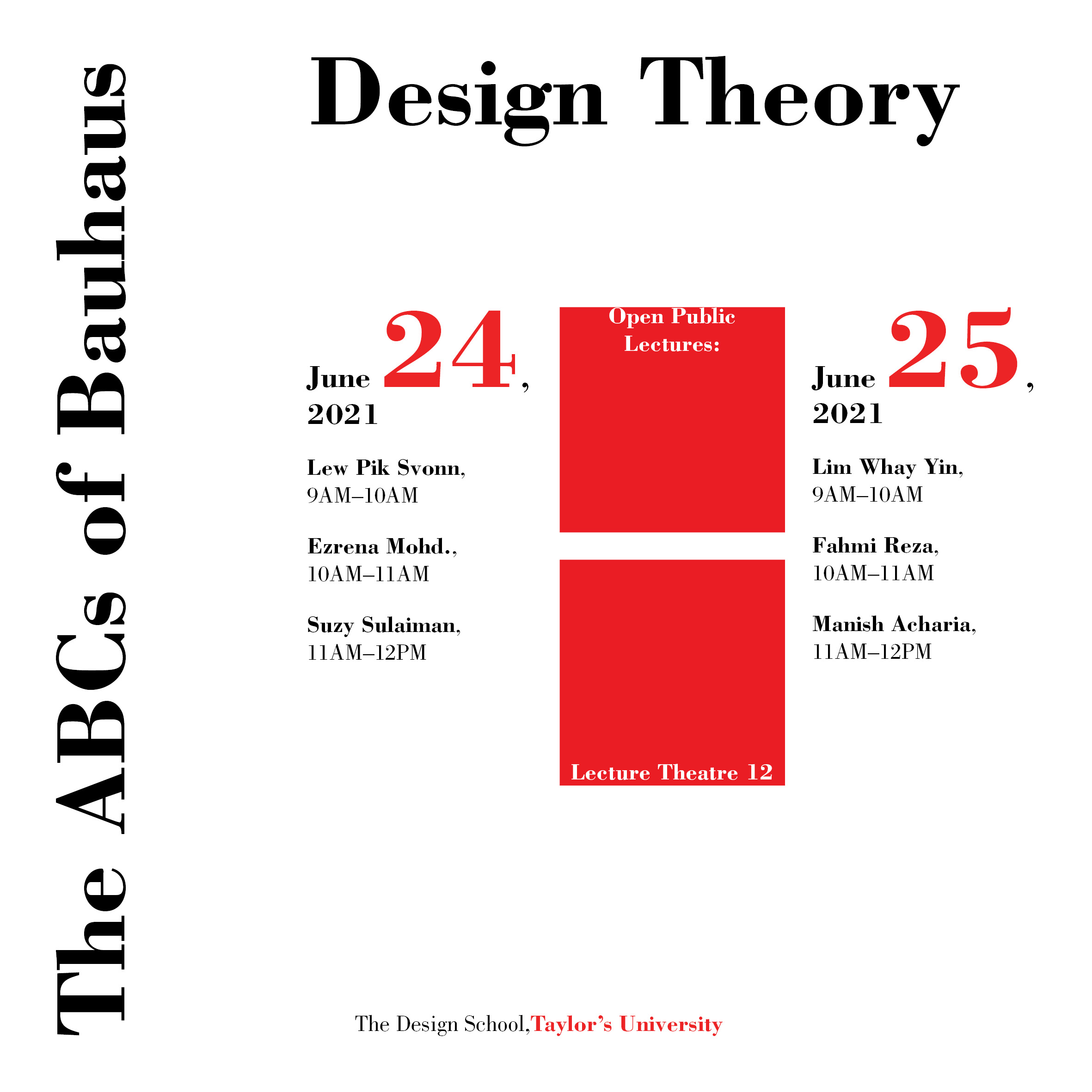

Figure 6.1 Modular System. JPEG

Figure 6.2 Axial System. JPEG
Figure 6.3 Transitional System. JPEG

Figure 6.4 Bilateral System. JPEG

Figure 6.5 Random System. JPEG

Figure 6.6 Radial System. JPEG
Final Submission without grids and guide
Final Submission with grids and guide
Exercise 2-Type and Play
Firstly, I do some research on some sample work by the senior and found that leaf and plant are most used object to analyze, I start by taking photo of everything that I can see, bridge in the highway, plant outside my balcony, gate of my house etc. at last I use a table in my house, and the stroke look interesting to me, so I do some analysis and find a interesting typeface in google font as reference.

Figure 7.1 Progression 1 (12.09.2023)
This is actually also my first attempt, and get some feedback, it's said that I should emphasize the transitional in the middle as that is the characteristic, not just the stroke, so I started to redo it in the class.
.png)
Figure 7.2 Progression 2 (18.09.2023)
Final Submission

Figure 7.3 final refinement (19.09.2023)

figure 7.4 type with poster. JPEG
Poster.PDF
Feedback
Reflection
Experience
Observation
Findings
Further Reading
.png)
Figure 8.1 Typographic system by Kimberley Elam
The 8 basic typography system I have seen in the lecture video, all of kind of same but for the modular system, the definition by Mr. Vinod is more clearly, but in the book are some kinds not too understandable.
In the constraints and line break, it said that when the format is small and line length are too long, we need to line break it, line breaking can sometime increase readability, but If I don't know after I line break it, how should I group it into a better composition.
The circle is an important graphic element, it can be used anywhere, circle retrained in a size can give designer a tool the guide the eye creates a pivot view and also it can attract reader tension to it.
A circle element put in different placement can create different composition, it just a small circle but it can create something exciting.
.png)
Figure 8.2 used of nonobjective element.

Comments
Post a Comment