Design Principles-Task 1
06.02.2024 - 25.06.2024/Week 1 - Week 3
Guan Wee Lun/0364012Design Principles/Bachelor of Design in Creative Media
Task 1: Exploration
List
First Week #1
06.02.2023
First week of the lectures, the class in main of giving briefing about the module (Design Principles). Ms. Yip led us to go through what are we going to do during the whole semester clear and precise. And lectures on introducing the principles of design.
#Visual Communication
Utilizing design to convey purposeful message to target audiences.#Elements of Design
Individual "Building Block"
- Point
- Simplest element to use as repetitive mark to form a line.
- Line
- it can indicate direction, define boundaries of shapes and spaces, imply solid masses or volume, suggest motion and emotion.
- it can present light and shadow despite on grouping them, and also mostly patterns and textures.
- Shape
- expand using within outline and visible when the line enclose together.
- It can separate as two categories as geometric and organic.
- Geometric is presented as precise and regular as circle, square, triangle etc.
- Organic is presented as irregular and free (Opposite of Geometric)
- Form
- Shape Pro Max, three-dimensional area are named as form.
- When the form enclosed, it is called volume.
- Mostly used in architecture and sculpture.

Figure 1.1 point line shape and form
- Texture
- It must be implied with two-dimensional media examples as illustration, painting or drawing.
- Tactile qualities of surface or visual representation of those qualities
- Actual and Simulated
- Experience by touch
- Implied
- created to look like a real texture.

figure 1.2 Texture
- Space
- Indefinable and general rectangle of all things
- The picture's surface define space as the edges— two dimensions of the height and width.
- Space (Con'd)
- from the outside, we can experience mass (Solid and occupied space).
- From the inside, we can experience volume (Amount of space a space occupied).
- In graphic design, the space refers to the area that a shape of form occupies. Positive space (inside the box), negative space (outside the box).
- Illusion of three-dimension space can be suggested through depth.
- archive by overlap of images, variation of size, placement and perspective.

figure 1.3 space
- Color
- A Lightwave Lengths that human eyes received and process from a reflected source.
- There are three variable of color that can be recognized is Hue, Value and intensity.
- Hue as colors of spectrum (RGBCMY).
- Lightness and darkness which refer to white to black.
- hue + white = tint
- hue + grey = tone
- hue + black = shade
- Intensity also called as saturation (Purity of a hue).
- Color schemes are the color grouping that provides distinct color harmonies.
- Monochromatic colors are based on value and saturation of single hue.
- Analogues colors = single hue color + another hue color that are the neighboring with the chosen hue color.
- Complementary colors = single hue color + another hue color that are the opposite the chosen hue color.

Figure 1.4 color
#Principles of Design
Organization fundamental the result from or guide the elements.
- Contrast
- Balance
- Emphasis
- Rule of Third
- Repetition/Pattern/Rythm
- Movement
- Hierarchy
- Alignment
- Harmony
- Unity
- Proportion
Contrast
- A juxtaposition of strongly opposite element, it can provide visual interest, highlight a point and express content.

Gestalt Theory
- Gestalt refer to the term form or shape in German.
- This theory describes the ways of human eye perceiving visual element.
- It shows how complex scenes to reduce as simple shape.
- Principle of similarity
- Human eyes tend to precise similar element in a design as complete.
- The brain can link the similar element together.
- Principle of Continuous
- Human eyes follow a path/line/curve of a design a prefer a continues flow of an element rather than separated element.
- Principle of Closure
- Human eyes prefer to see a complete shape, the brain can fill in the missing visual information if the visual element is not complete.
- Principle of Proximity
- Process of ensuring related element is place together.
- Close proximity can show relationship of the element and categorized into one unit.
- Principle of Figure/Ground
- Objects are instinctively perceived as being either foreground or background.
- Law of symmetry and order
- It stated that element that are symmetrical would be more likely to group together.

Figure 1.6 Gestalt Theory
Balance
- distribution of visual weight in a design
- visual equilibrium of the element that cause the image to be balanced.
- Symmetrical balance
- equal weight on equal sides of centrally placed fulcrum
- the equal arrangement of element on axis will show as bilateral balance.
- Radial balance is arrangement equal around a central point.
- Approximate symmetry is in equal but not identical form are arranged around a fulcrum line.
- Asymmetrical balance
- Unequal visual weight on each side of composition.
- It offers more visual variety, but it is more complex.

Figure 1.7 Balance
The Golden Ratio
- also known as phi in math.
- It can bring harmony, balance and structure.
- multiply 1.618 to get new shape. (shape like a shell)

Figure 1.8 Golden Ratio
The rule of thirds
- A composition guideline that mostly used in photography.
- divide an image equally into thirds, put the subject of the image on the intersection of those line or along the line.

Figure 1.9 Rule of Third
Emphasis
- It is used to create dominance and focus.
- Color, shape and value can be used to create dominance.

Figure 1.11 Emphasis
- It can create rhythm and pattern within the work.
- Variety can create rhythms exiting and active to avoid monotony.
- *Variety is to change or a little different and objects in composition, also to involve varying angles, exposure, composition etc.
- It led an eye in, around and through a composition.
- Movement in a visual image occur when object seem to be moving in a visual image.
figure 1.13 movement

Hierarchy
- Choreography of content in a composition to communicate information and convey meaning.
- Its direct viewer to the most important information first.
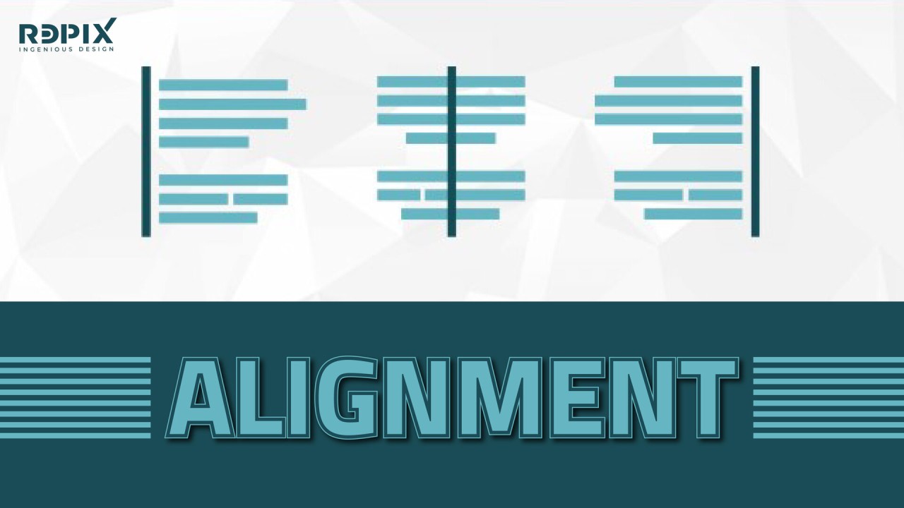
Alignment
- Placement of element to give a sense of unity and cohesion, and to create aesthetic and unity.
Figure 1.14 alignment
Harmony
- Selection of element that share a common trait. And a sense of all elements fit in together.
- It became monotony without variety.
Unity
- Repetition of particular elements
- The element composed in a way of balance and give a sense of oneness, creating a theme.

- Scale
- Scale refers to the size of one object relation to another object.
- Proportion
- Proportion refers to the size of part of an object in relationship to other parts of same object.
Figure 1.16 scale and proportion

Symbol
- A sign/shape /object to represent something else.
- It can also provide information.
- Pictorial symbol
- Picture related and simplified symbol
- Abstract symbol
- look like the object represent but less detailed.
- Arbitrary symbol
- It has no resemblance to the object they represent.
- It's invented with the meaning constructed.

Figure 1.17 Symbol
Word and Image
- It is to let the user or viewer relate a concept or a brand if it is suitable and composed in a right way.
Instruction
Task 1: Exploration
Requirement
- Pick and briefly describe one goal from the United Nations’ Sustainable Development Goals (UNSDG).
- Select an existing art/design work that revolves around that goal of your choice. Beneath the image, include the credit line of the art/design work (title of art/design work, artist’s/designer’s name, year, size, medium, source link). Some works may not have all these but provide as complete as possible.
- Explain, in about 100-150 words, why you chose that design in relation to the UNSDG goal and list the design principles you observed in that design.
Research
Theme
Sustainable Development Goals (SDG)
Topic

Figure 2.1 SDG 1 No Poverty
Goal 1 of the Sustainable Development Agenda is to "End poverty in all its forms everywhere." Ensuring that all men, women, and children have equal access to resources, basic services, and social protection by 2030 is the aim connected with SDG 1. This entails actions to lower the proportion of the population living in poverty, guarantee equitable access to financial resources, and provide basic necessities including food, shelter, healthcare, and education. The objective is to end severe poverty on a worldwide scale and establish the means for everyone to live a life that is respectable and sustainable.
Poverty defined by the world bank organization as hunger, lack of shelter, not having access to medical, education and job.
Analysis

Figure 2.2 Victo Ngai, Humanitarian Raid, Mother Jones, AD: Carol Perot, 2016, Digital illustration,
990 x 1290
990 x 1290
The author of this piece of art by Victo Ngai explained how international financial cooperation and the
World Bank's mission to combat poverty have diverged, with the former allowing
the rich to become richer and the latter to become poorer. The wealthy class
lives at the top of the social scale and is thought to have been raised by world bank organization as the hand in the artwork far away from poverty. To survive in the Hunger Game, the poverty must
simply work harder. The illustration related on why SDG 1 no poverty are
necessity, and what will happen if we don’t reduce poverty.
Design Principles:
- Contrast
- Emphasis
- Balance
Feedback
Week 2 14.02.2024
After reviewing my blog, Mr. Zeon offered me some advice about include images in my teaching section. After that, he reviewed my project and advised me to select artwork that demonstrates design principles in order to complete my assignment. He also advised me to learn more about the meaning and description of the artwork.
Week 3 21.02.2024
He reviewed my work again this week and reminded me to include the attribution line and the image's website link. And he suggested that in order to save me time, the description of the design principles pertaining to the artwork may be moved to project 2, as the instruction only included list down to that point.
Reflection
By doing the task 1 of Design Principles, I observed that the importance of Design Principles inside an artwork, and the flow of designing an artwork. Designer don't just design a meaningless artwork, it's need time to research on and making each decision after doing research. Creating a meaningful design need a process of time and effort. Each principles have it's meaning for designing not just some theory to memorize but to practice of it.
Further Reading
Proximity
- Relation between element inside an artwork
- It should be put around element which is closed proximity
- Organize element by closed proximity.
White space
- keeping white space can be a crucial used but keeping white space and organise element between can be easy for the viewer.

Comments
Post a Comment