Typography Task 1/Excersices
Typography/Bachelor of Design in Creative Media
Task 1
LECTURES
Week 1
TYPO_0_INTROUDUCTION
- TYPOGRAPHY =The act of creating letter, the creation of typefaces or type family. Typography can be an animation, a logo, an app design, it is all over our world.
- CALIGRAPHY = The writing style, as write out the word.
- LETTERING =Draw out the circumferences of the letter.
- FONT (from French word "find") =refer to individual font or weight within the typeface
- i.e.: Georgia Regular, Geogia Italic, Geogia bold and more

- TYPEFACES = refer to the entire family of fonts that share similar characteristic or styles.
- i.e.: Georgia, Arial, Times New Romans, Didot, Futura and more
TYPO_1_DEVELOPEMENT
TIMELINE


Oldstyle (1475): Based upon the lowercase forms used by Italian humanist scholars for book copying.


Week 2
TYPO_3_TEXT PART 1
KERNING AND LETTERSPACE
- Kerning: Automatic adjustment of space and letterform between letters
figure 1.2.1 Kerning - Letterspacing: Add space between the letters. (Usually for uppercase letter in headline)
- not encourage to letterspace for lowercase letterform because it will break the counter form which reduce the readability of the letterform.
- Tracking: Add and reduce space in a letter or sentence.
- Normal Tracking
- Loose Tracking
- Tight Tracking

- Flush Left: The most natural way of formatting text because this format most closely mirror the asymmetrical experience of handwriting.
- Centered: This format imposes symmetry upon the text, assigning equal value and weight to both ends of any line. (don't do it for a large amount of text)
- Flush Right: This format places emphasis on the end of a line as opposed to its start. (don't do it for a large amount of text)
- Justified: Like centering, this format imposes a symmetrical shape on the text, assigning equal value and weight to both start and end at the same point.
TEXTURE
- Different typeface and texture can give different impact to the reader who were reading the text.
LEADING AND LINE LENGTH
- Type size: It affects the readability of the reader, so it should be large enough to read.
- Leading: Text that is set too tightly encourages vertical eye movement. Type that is set too loosely creates striped patterns that distract the reader from the material at hand.
- Line Length: A good rule of thumb is to keep line length between 55-65 characters. Extremely long or short lines lengths impairs reading.
Week 3
TYPO_3_TEXT PART 2
INDICATING PARAGRAPH
- Pilcrow (¶)
- Line space: The leading should be THREE point larger than the text size, the paragraph spacing should be same as the leading in order to maintain cross alignment.

figure 1.3.1 Difference of Leading and Linespacing
- Indentation: It was used to save space for Newspaper, it is the same size of life spacing as the point size of the text (It is best use in JUSTIFIED)

figure 1.3.2 Indentation
- Extended Paragraph: Create unusually wide column of text (Sometimes in academic writing)

figure 1.3.3 Extended Paragraph
- Widows: A short line of type left alone at the end of a column of text
- Orphans: A short line of type left alone at the start of new column

HIGHLIGHTING TEXT
HEADLINE WITHIN TEXT
B head: subordinate to A head.

Week 4
TYPO_2_BASICS
DESCRIBING LETTERFORMS
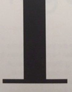
- Baseline: The visual base of the letterform (Imaginary line)
- Median: The imaginary line defining the X height of the letterform.
- X-height (between the baseline and the median line): The height of any lowercase 'x' (in every typeface)
- Cap height: Above median line.
- Ascender line: Above Cap Height
- Descender line: below Baseline.
- Optical Adjustment: Ascending letter tend to be slightly above the Capital letter in order to give the impression of equal height.
figure 1.4.1 Describing Letterforms - Stoke: Any line that defines the basic letterform
- Apex: The point above created by joining two diagonal stems.
- Vertex: the point below created by joining two diagonal stems.
- Arm: Short stroke extend from the stem stroke


- Ascender: Stoke that exceed the median line (for lowercase letterform)
- Barb: Half-serif of the curve stoke

figure 1.4.3 The Barb - Beak: Half-serif finish on some horizontal arm


figure 1.4.4 The Beak
- Bowl: The rounded form that describes a counter
- Bracket: The transition between the serif and the stem
- Cross bar: Stroke connected two stems s.
- Cross Stroke: Horizontal stroke that join two stems together (i.e., lowercase 'f' and 't')
- Crotch: The interior space where two stoke meet.

figure 1.4.5 The Crotch
- Descender: Stem below the baseline (lowercase letterform)
- Ear: Stoke extending from the main stem/body of the letterform
- Em: Distance equal to the size of typefaces (about width of a long dash—)
- En: Half the size of Em (about width of short dash-)
- Finial: The rounded non-serif terminal to a stroke

figure 1.4.6 The Finial
- Leg: Short stroke off the stem of letterform
- Ligature: Character form by two letterforms
figure 1.4.7 The ligature - Link: Stroke that connected the bowl and the loop of a lowercase 'g'


figure 1.4.9 The link
- Loop: The bowl created in the descender of lower case 'g'
- Serif: The right-angled or oblique foot at the end of the stroke.
- Shoulder: Curved stroke that is not part of a bowl.
- Spine: Curved stem of the S.
- Spur: The extension the articulates the junction of the curved and rectilinear stroke.
figure 1.4.10 The Spur - Stem: The significant vertical or oblique stroke.
- Stress: The orientation of the letterform, indicated by the thin stroke in round forms.


figure 1.4.11 The Stress
- Swatch: The flourish extending the stroke
figure 1.4.12 The Swatch - Tail: Curved diagonal stroke at the finish of certain letterforms.
- Terminal: The self-contained finish of stroke without a serif.

- Uppercase and lowercase
- Small Capitals: Uppercase letterforms draw to the x-height of the typeface.
figure 1.4.13 Smal Capitals - Uppercase Numerals: Numbers that are same height as uppercase letterform.
- Lowercase Numerals: Number that are same height as lowercase letterform.
- Italic and Romans

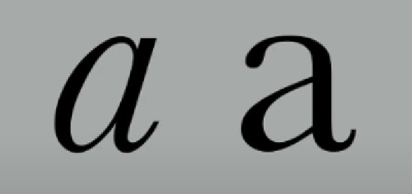
figure 1.4.14 Italic and Roman
- Punctuation & Miscellaneous Characters
- Ornaments: Used as flourishes in invitations or certificates
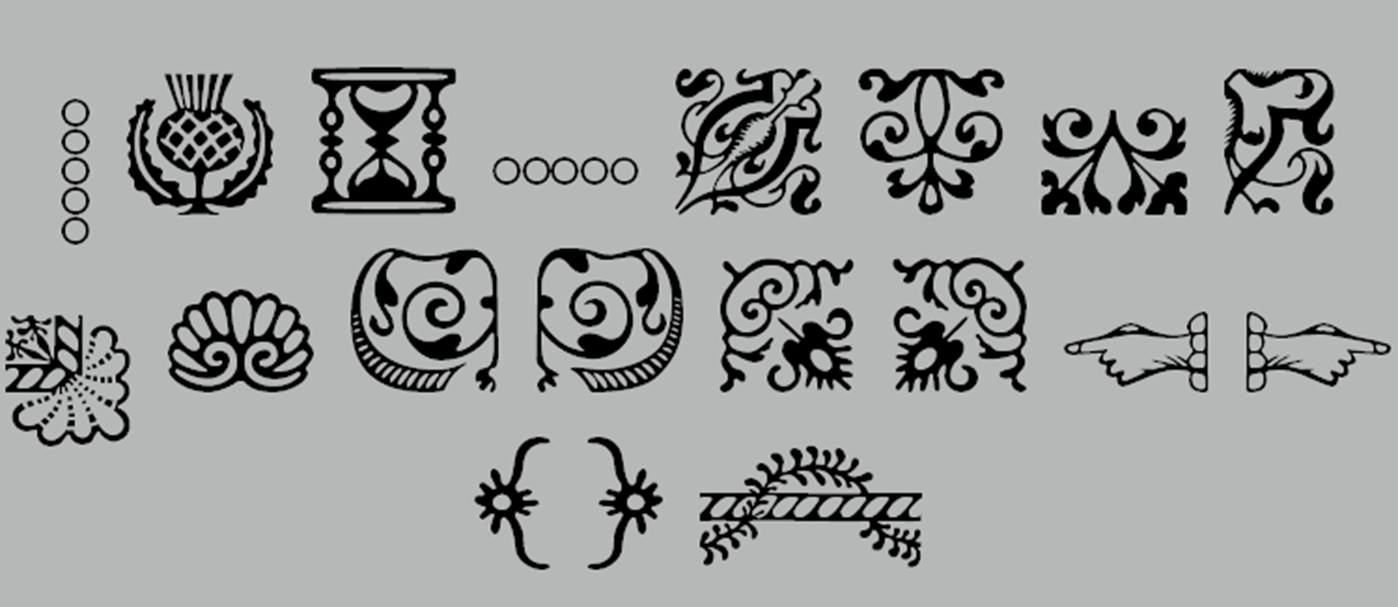
figure 1.4.15 Ornaments
DESCRIBING TYPEFACES

figure 1.4.16 Typefaces
You can’t be a good typographer, if you aren’t a good reader. — Stephen Cole
Week 5
TYPO_5_UNDERSTANDING
UNDERSTANDING LETTERFORM Most of the alphabet letterform look symmetrical, but in closer inspection, it's not symmetrical for some reason.


figure 1.5.1 Baskerville Stoke and Univers Stroke

figure 1.5.2 Comparison between Helvetica and Univers
FORM/COUNTERFORM Knowing the space outside the letterform are equally important because it aids in readability and legibility of formatted text. Reducing or adding the space between letterform would affect the readability of the letterform. Before designing a letter, it's important to analyze existing letterform.
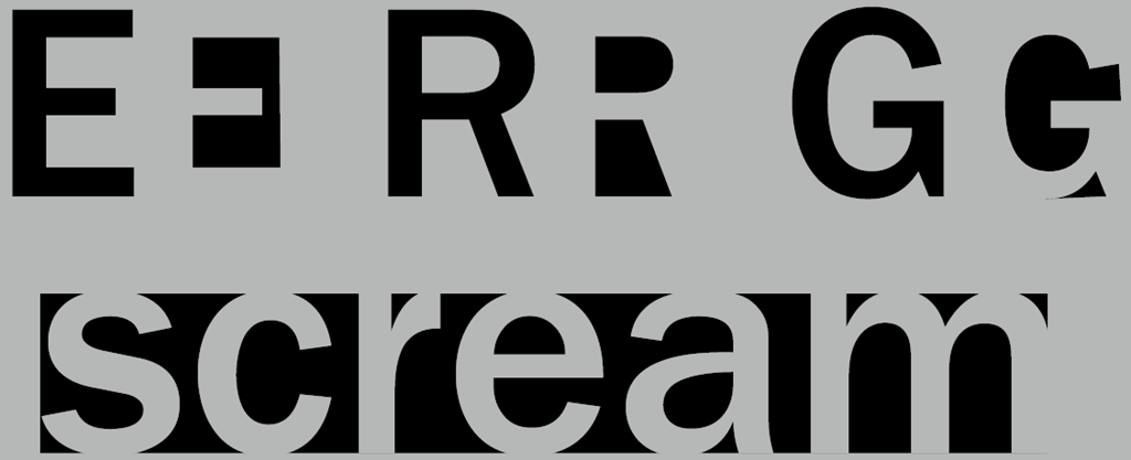
figure 1.5.3 Counter form
CONTRAST

figure 1.5.4 Rudi Ruegg diagram
Week 6
TYPO_6_SCREEN & PRINT
PRINT TYPE Good typefaces for print i.e., Print-Caslon, Garamond, Baskerville (Their characteristic which are elegant and intellectual but also highly readable when set at small font size.)
SCREEN TYPE Typefaces intended for use on the web are optimized and often modified to enhance readability and performance onscreen in a variety of digital environments. This can include a taller x-height (or reduced ascenders and descenders), wider letterforms, more open counters, heavier thin strokes and serifs, reduced stroke contrast, as well as modified curves and angles for some designs. Another important adjustment – especially for typefaces intended for smaller sizes – is more open spacing. All of these factors serve to improve character recognition and overall readability in the non-print environment, which can include the web, e-books, e-readers, and mobile devices.
- Hyperlink: A word, phrase, or image that you can click on to jump to a new document or a new section within the current document. Hyperlinks are found in nearly all Web pages, allowing users to click their way from page to another. Text hyperlinks are normally blue and underlined by default.
- Font Size for Screen: 16-pixel point size as about same size as text printed in a book, this is accounting for reading distance.
- Web Safe Fonts: Open Sans, Lato, Arial, Helvetica, Times New Roman, Times, Courier New, Courier, Verdana, Georgia, Palatino, Garamond.
- Static Typography: It has minimal characteristic in expressing words. Traditional characteristics such as bold and italic offer only a fraction of the expressive potential of dynamic properties.
- Motion Typography: Temporal media offer typographers' opportunities to dramatize type, for letterforms to become fluid and kinetic.
INTRUCTIONS
Week 1 (04.04.2023)
Task 1 exercise 1 type expression (sketch)


figure 2.1.2 sketch (10.4.2023)
Week 2 (11.04.2023)
Task 1 exercise 1 type expression (digitization)
So, for the exercise two I digitize these four words on top which is shatter, blur, melt and throw. At the beginning, I just digitize it and try to add some effect on it, it is a tough try for me that I didn't use adobe illustrator before, but I managed to enhance it and digitize.

Week 3 (16.04.2023)
Task 1 exercise 1 type expression (animation)

figure 2.3.1 animation 1 (20.04.2023)


figure 2.3.4 animation progression 3
Step 4-export and done


figure2.3.6 animation2.2 (26.4.2023)

figure 2.3.7 animation 3( 08.05.2023)
Week 4
Task 1 exercise 2 formatting text


figure 2.5.1 Layout exercise progression (02.05.2023)

figure 2.5.2 Layout 1 (02.05.2023)


figure 2.5.4 Layout 3 (04.05.2023)

figure 2.5.5 Layout 4 (05.05.2023)
Final Outcome
Font/s: Futura Std
Type Size/s: 48 pt
Leading: 50 pt
Paragraph spacing: 0
BODY
Font/s: Bembo Std
Type Size/s: 9 pt
Leading: 11 pt
Paragraph spacing: 11 pt
Characters per-line: 60
Alignment: left justified
Margins: 300 pt top, 36 mm left + right + bottom
Columns: 4
Gutter: 14.173 pt

figure 2.5.6 final text formatting layout without grids (09.05.2023)

FEEDBACK
Week 2
Week 3
General feedback: The design is fine but we should be more on the composition, for enhancing the effect of the four word we did, the composition of word shouldn't be just in the middle, it cannot express the word too powerful, we should think more on the composition. Specific feedback: Mr Vinods told me to remove the shatter piece under the word, it is extra.And,the blur effect of the word "BLUR" can be change into grey color not just in black. After that, remove the puddle under the melt as I have already made the word in melt effect. For the last word "THROW", Mr vinod suggested me to enhance the bin made by a few of alphabet W,not just using W but use some effect on it to make it like a bin.Week 4
General feedback: The frame of the GIF needs to be added more in order to be smoother. Specific feedback: The end of the gif needs to add some more frame to let the frame smoother.Week 5
General feedback:about the text formatting, the alignment is important and the image should related to the text information Specific feedback:The kerning should be more patient on it, put more effort on the alignment and kerningREFLECTIONS
Experience
In a nutshell, I think my experience for the task 1 except for the exercise 2 ( It quite complicated about the kerning part), apart from that, I can still handle the assignment for now. This is my first step of stepping in uni and as a design student, It quite different from what I know before I am in design school. what I thought about design before is just about work, just doing creative work, but not theory, typography is all about theory, rule and all, but I can still get used to it.Observation
Findings
FURTHER READING

figure 3.2 Typography, Referenced: A Comprehensive Visual Guide to the Language, History, and Practice of Typography
THIS book is written by a lot of authors (Jason Tselentis, Allan Haley, Richard Poulin, Tony Seddon, Gerry Leonidas, Ina Saltz, Kathryn Henderson, Tyler Alterman.) It is about basic knowledge of typography which contained history of typography, development, type classification and identification and typographic principles.
Although Mr Vinod have told us about the basic development and timeline in the lecture video, but this book told us more specify in it about the history and principles of it. For me the most useful part in this book is the typographic principles and the layout of book, it gave me many kinds of idea on my second task of formatting text. I don't take much effort of reading the timeline part because I can be sleepy if I concentrate in reading history, and the classification and the identification part contained a lot of font and typeface, I didn't memorize all of it, this is quite a useful book for me in this stages.

Comments
Post a Comment